
Does a food font, as a visual element, influence how consumers perceive their purchasing decision? Statistics say that 93% of consumers consider that visual appearance to be indeed a crucial aspect in their food and purchasing decisions. They trigger and deliver a certain emotional connection, and that’s the very reason that you must carefully pick the winning one according to your gastronomy context.
Key Takeaways:
The following picks might seem familiar in style to you. Yet, their creative side leans on personality and versatility, which branding needs the most.

The chunky weight combined with the geometric shapes of this font appears edgy. They look fresh and tempting, which makes it a scrumptious font for food, displaying an urban or contemporary vibe. This coffee shop font would also give an inviting touch that your short copy and clean-looking menu book need.
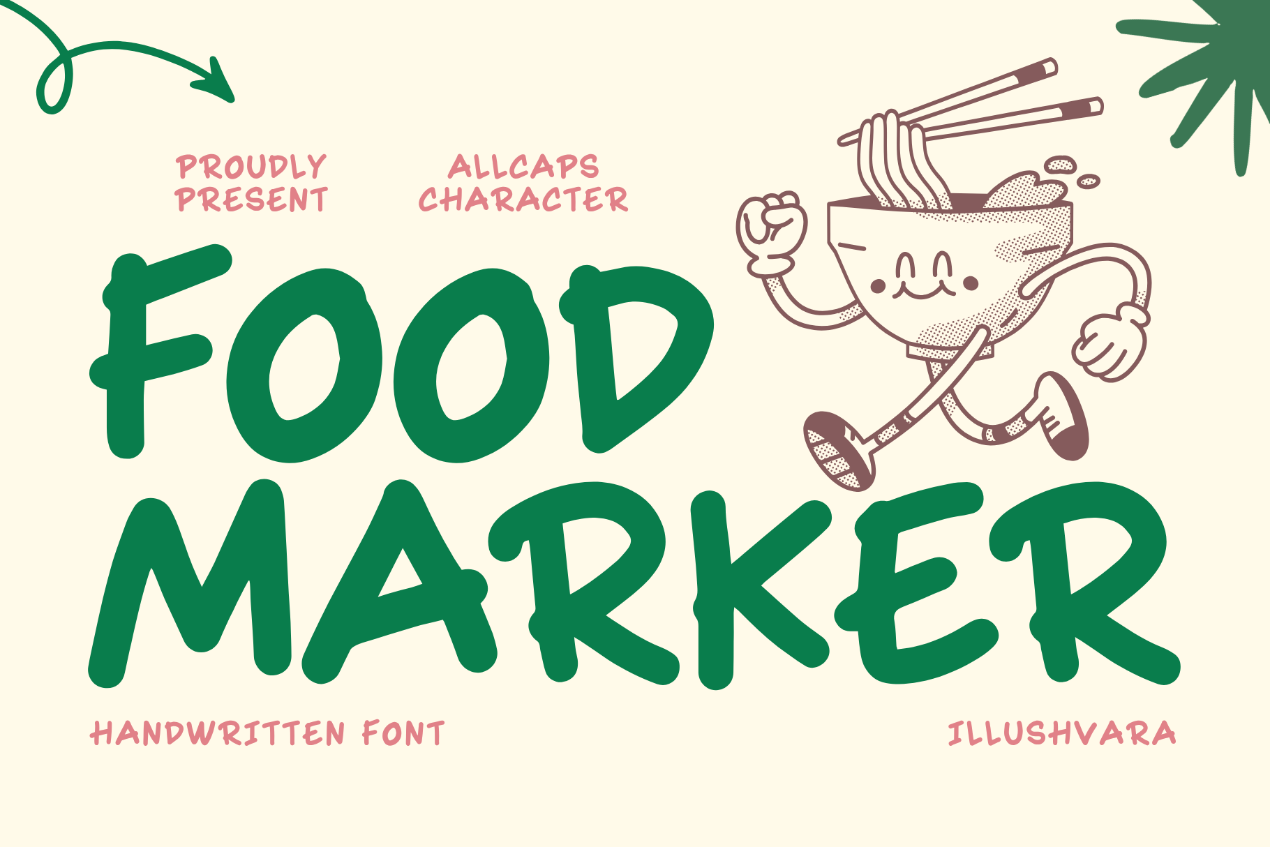
Although the characters are all in caps mode, the Food Marker food typeface ticks the check box: looking genuine, humble, yet approachable with proper readability. With these traits, this handwritten font is a go-to for coffee shop and restaurant brands since it conveys a warm and friendly image to consumers. Very versatile choice for menu, logo, or special offer posters, packaging, and even social media posts.
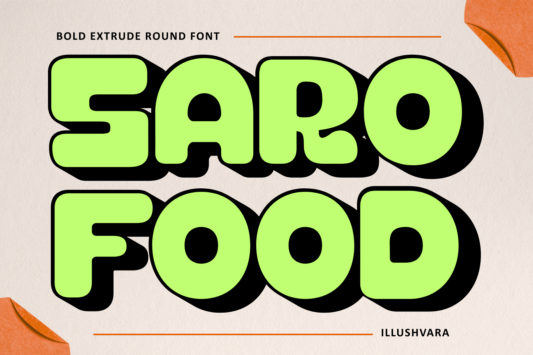
With a rounded shape, this font delivers a dynamic and fun style, as well as necessary traits to catch attention in display design. Saro Food brings an energetic retro style, bringing a more intimate yet refreshing familiarity. Use it primarily for logos, signage, packaging or a concise menu book for a coffee shop, cafe, and restaurant.
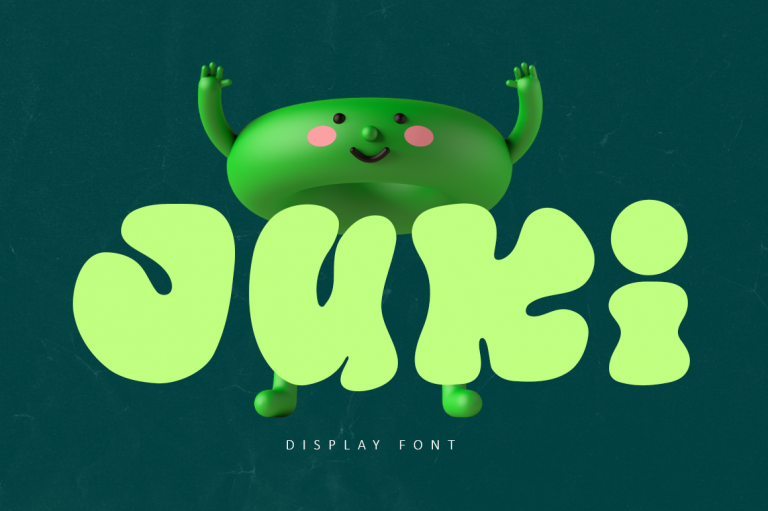
Juki brings another level of handwriting font style with its grooved characters. Any brand can make its fun personality stand out with this playful, youthful, and fun food font personality. Apply this to any comms media with your consumer, including food packaging, labels, and logos.
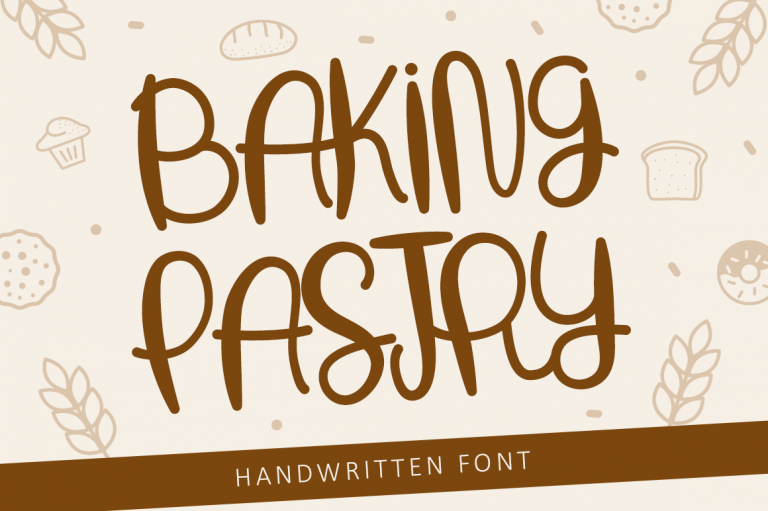
Fonts for cafes do not always need to look sophisticated. Leveraging one with a rounded shape-handwriting style, like Baking Pastry, gives your brand a bubbly and warm feel. Apply this font to bring a crunchy yet soft touch to packaging, menus, or social media designs.
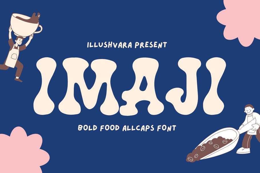
Imaji boasts a unique visual appearance; it mimics a Halloween-themed font and shows confidence. With its energetic look, this one has the knack to catch attention that your restaurant, bakery branding, or coffee shop font needs. Put Imaji as your primary font choice for headlines, labels, and promotional material, and place a logo that needs concise copy for a hook.
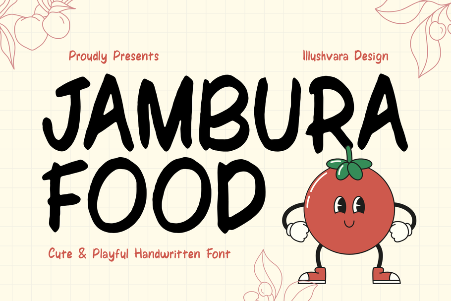
Rather than playful strokes, thick weight, or bold shapes, Jambura Food comes in clean and neat handwriting style. This food font looks very easy-going and easy-to-notice, just like your close and dear friends. This font style works well across media and vibes, be it a menu, social media, poster, or logo in a retro, casual, modern, or vintage feel.
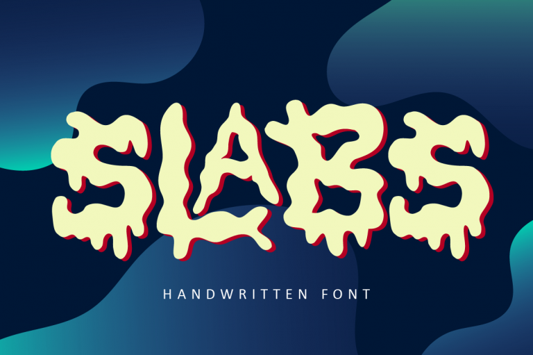
If you consider going with something totally quirky, Slabs comes in handy. Its abstract and thick-weight strokes give a laid-back vibe while showing the daring personality you need to be attractive. Use it as the primary font accent in logos, signages, displays, the ones that need a strong kick.
Your gastronomy menu needs seasoning, and so does its branding. When you pick or implement the food font in your communication materials, roll out the following practical tips.
Creativity is usually the main aspect owners look for when choosing a font in branding. However, even in the gastronomy industry, you still need to pay attention to food font readability and its psychological representation.
Pick one that includes various weights and family so that you can easily combine them while still keeping the cohesiveness intact in your branding effort.
When you look for a sheer font collection for gastronomy brands all in one place, go straight to the Illushvara website. Our typefaces were crafted with three essential aspects in mind, ready to serve your specific branding purpose.

